The Power of Colour in 1930s Schools and Hospitals

In the 1930s, amid economic turmoil and societal shifts, interior design took a pivotal role in enhancing environments where people learned and healed. Schools and hospitals, institutions foundational to society, witnessed a transformation in their interiors through a strategic application of colour. This shift wasn't just about aesthetics; it was a calculated move to influence mood, behaviour, and the efficacy of learning and healing environments.
Boosting Learning with Colour
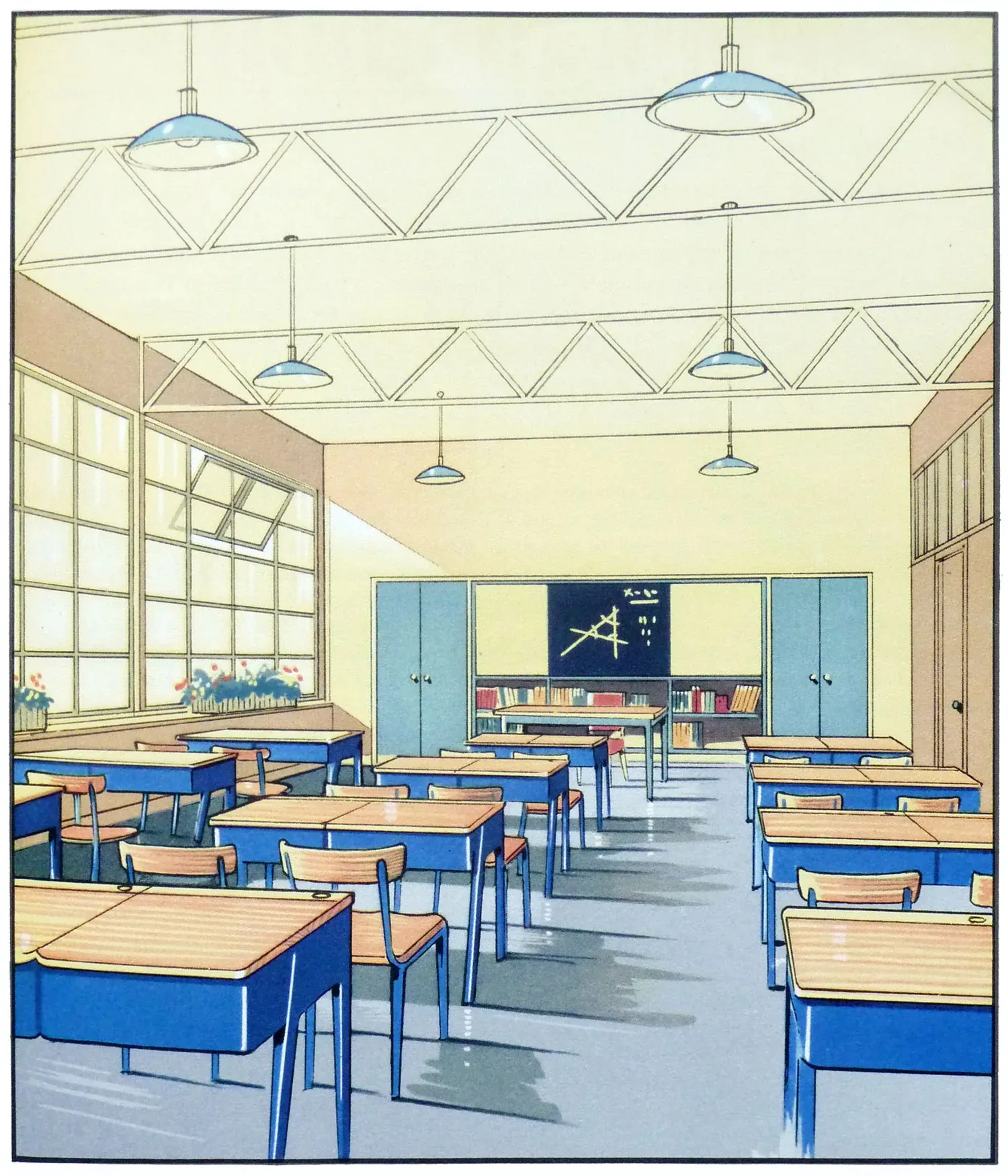
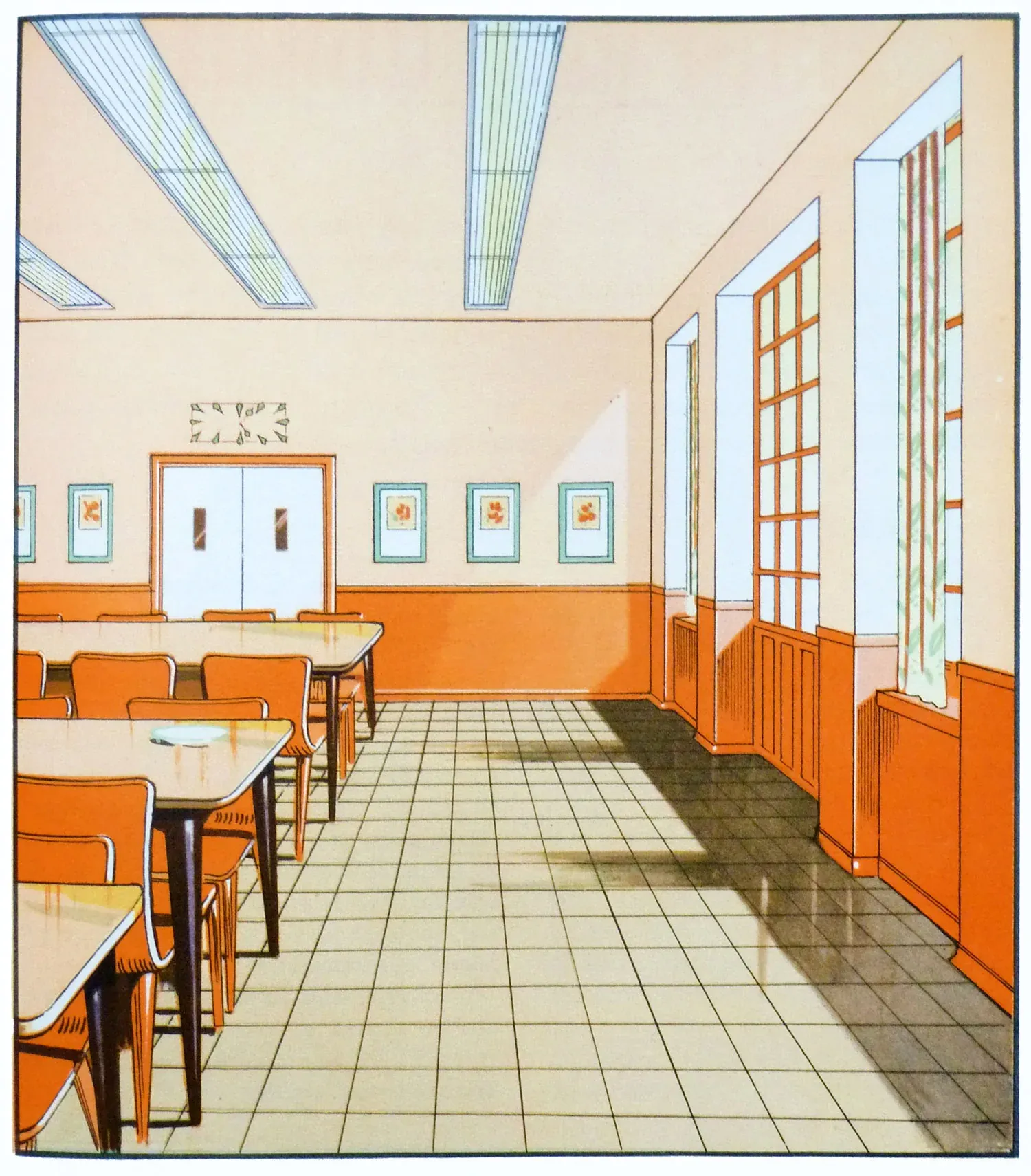
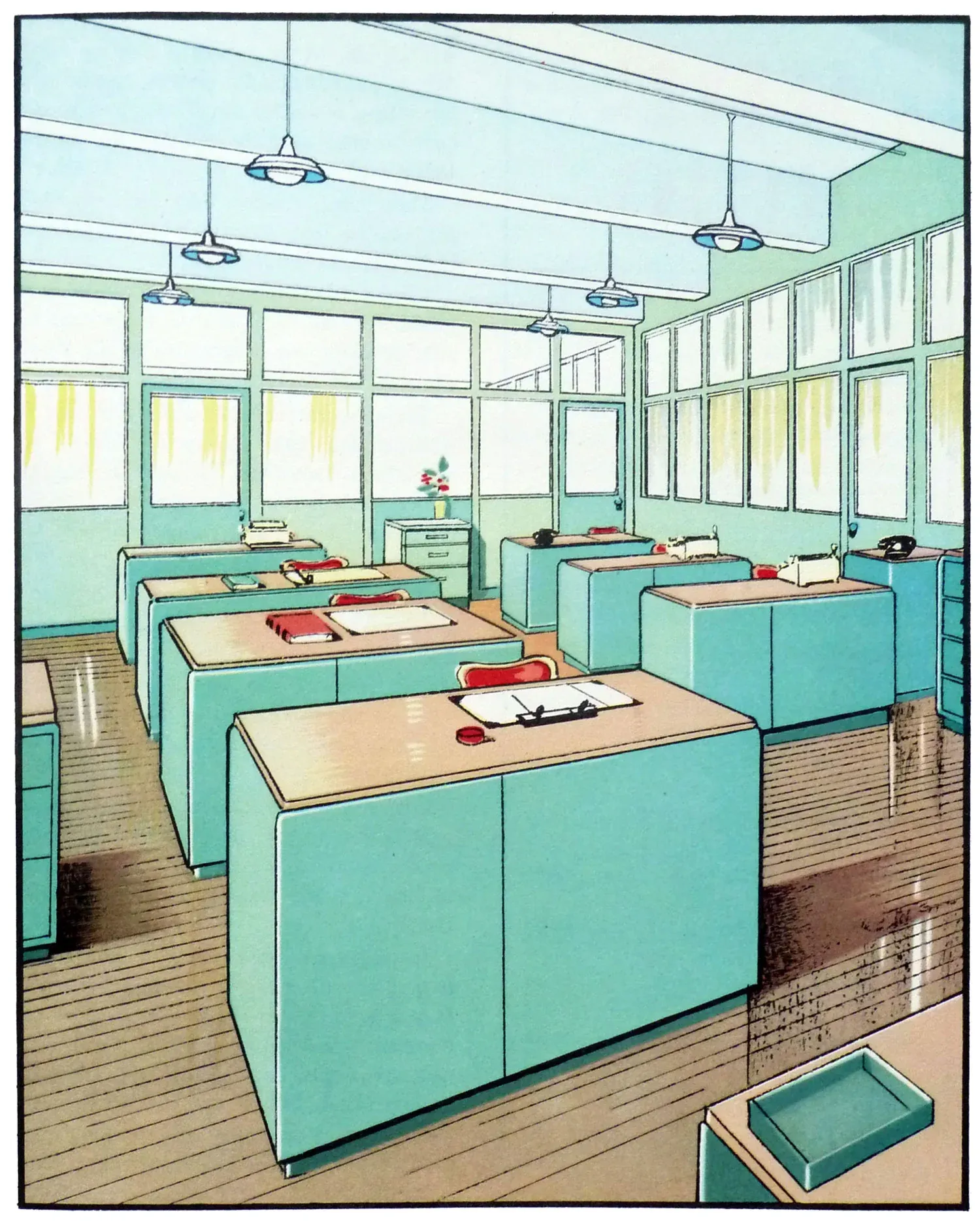
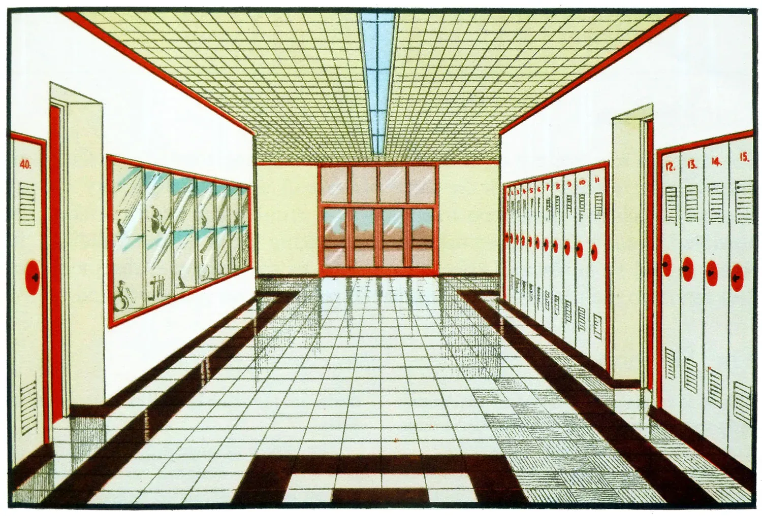
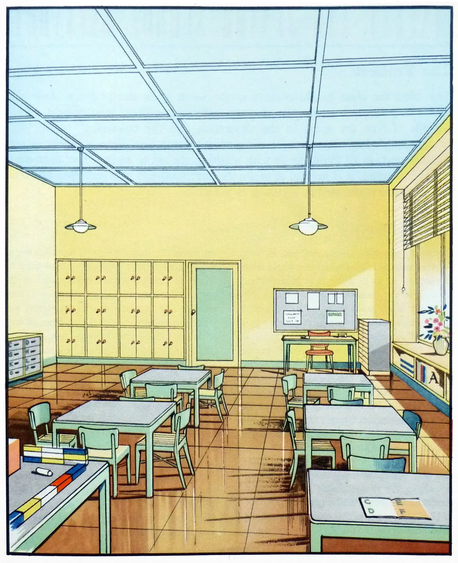
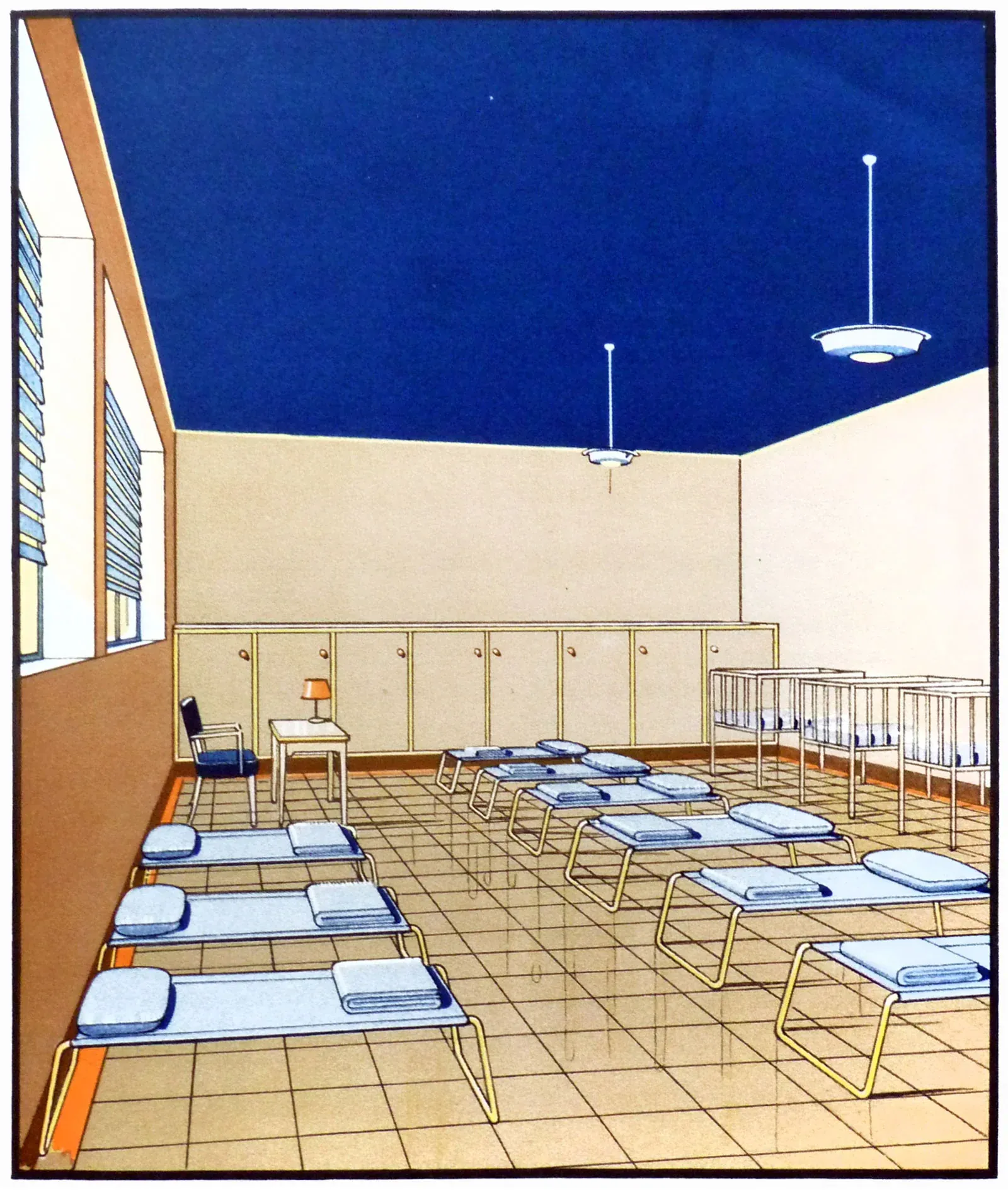
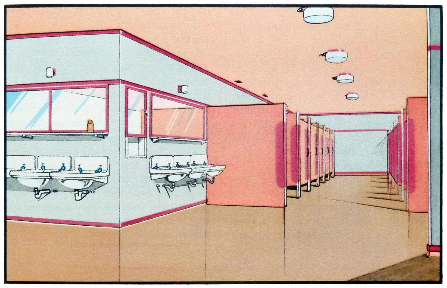
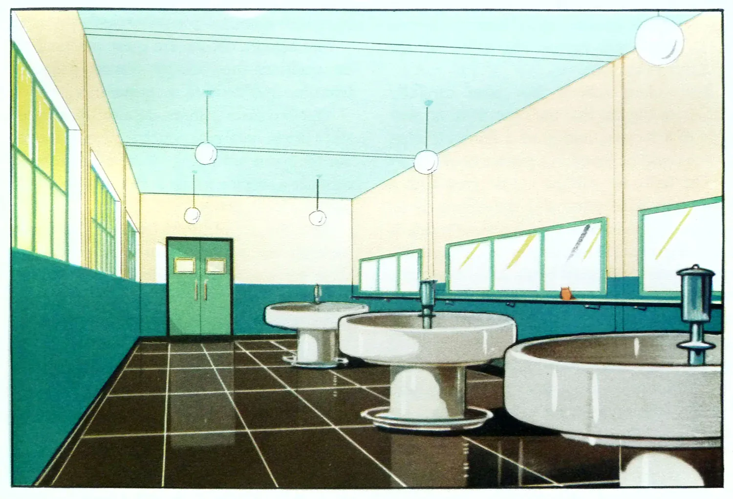
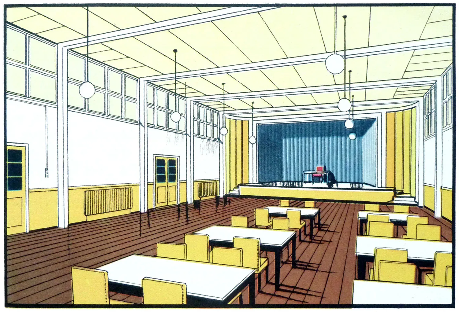
Educational institutions during the 1930s began embracing colour to improve focus and stimulate learning. Gone were the drab, monotonous classroom walls, replaced by vibrant colours designed to energize and engage young minds. Light blues and greens were favoured in classrooms for their calming effects, which helped to reduce anxiety and promote concentration among students. Brighter colours like yellow were introduced in play areas to stimulate energy and encourage creativity.
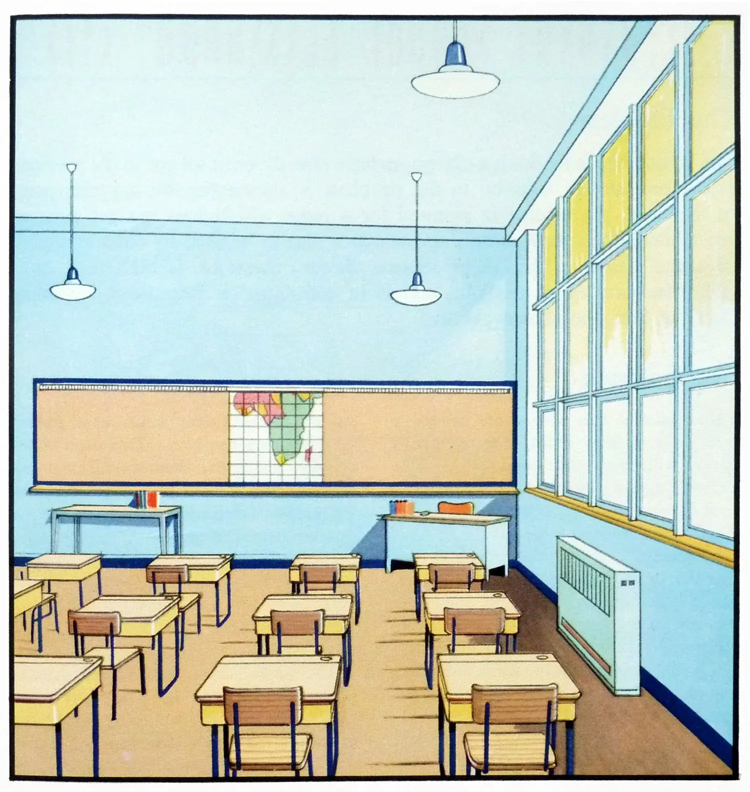
This thoughtful use of colour wasn’t arbitrary; it was backed by emerging psychological studies that linked environment colours to cognitive effects. Schools became testing grounds for these theories, turning classrooms into canvases that could potentially boost learning retention and student morale.
Healing with a Palette

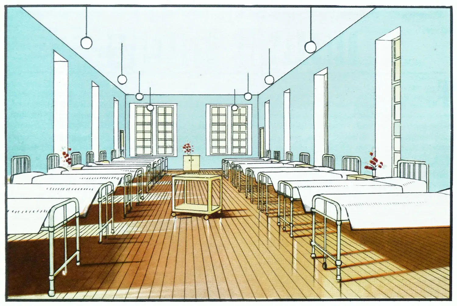
Hospitals, too, leveraged colour psychology to enhance patient care. The stark, sterile white traditionally used in hospitals shifted towards more soothing palettes. Soft greens and blues were introduced in patient rooms and recovery areas to create a tranquil atmosphere, aiding in stress reduction and overall well-being.
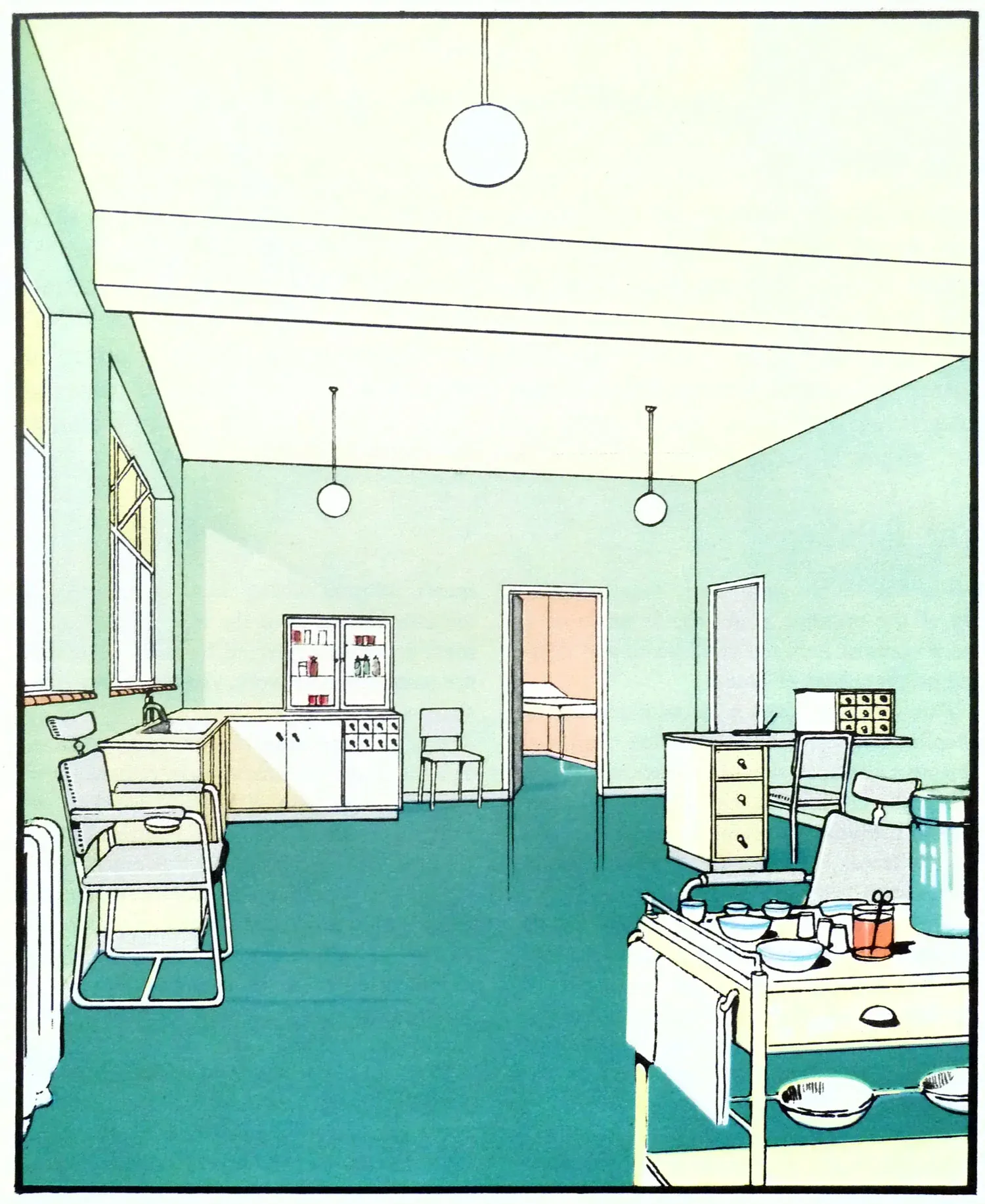
These colours were chosen for their ability to transform the feel of a space—a tool to make hospitals less intimidating and more comforting. The idea was to create environments that could help accelerate healing by psychologically uplifting patients, reducing the feeling of institutionalization, and making spaces feel more personalized and caring.
Design with Purpose
The use of colour in 1930s schools and hospitals was a deliberate, purpose-driven element of interior design. It was part of a broader move towards humanizing spaces that were traditionally utilitarian and stark. Designers of the era were pioneers, recognizing and harnessing the power of colour to affect human emotion and function. Personally, while things have definitely changed, I still love to draw inspiration from "by-gone times".
For today's interior designers, the lessons from the 1930s are clear. Colour is not just a matter of decor—it's a functional tool that can and should be used thoughtfully to enhance the environments where people spend significant amounts of time. Whether it's in educational settings or healthcare facilities, the thoughtful application of colour can profoundly impact how these spaces are perceived and experienced.
As we continue to explore and understand the intersection of psychology and environmental design, the vibrant, thoughtful palettes of the 1930s remind us of the powerful role interior design plays in everyday life.
Source of the images:
 Neal Whittington