Off Duty Pilates Studio
It is a well-known saying that a sound body has a sound mind. The saying itself demonstrates the close relationship and equilibrium between the mind and body which plays a key role in our wellness and success while enjoying every moment of life.
Off Duty Pilates studio is a fitness studio founded by an all-women team of young fitness enthusiasts. The core idea of their vision is that workout should be more fun than work and to provide members services for the wellness of their mind and body. I designed the studio space by keeping the space and users’ needs in mind to provide them a functional, motivating, and comfortable environment.
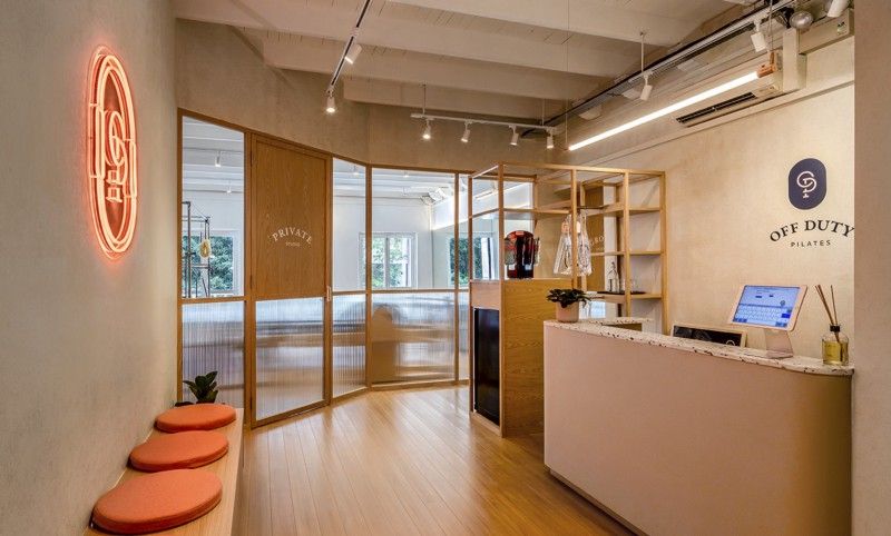
The studio design blended aesthetics and a training atmosphere to create a tranquil and light-filled active space that provides a relaxing place for people to stay and enjoy their workout after a long day at work. Being the first Pilates studio in Singapore that offers upbeat and energetic hybrid classes, the design had to complement the studio’s bold, chic and vibrant identity.
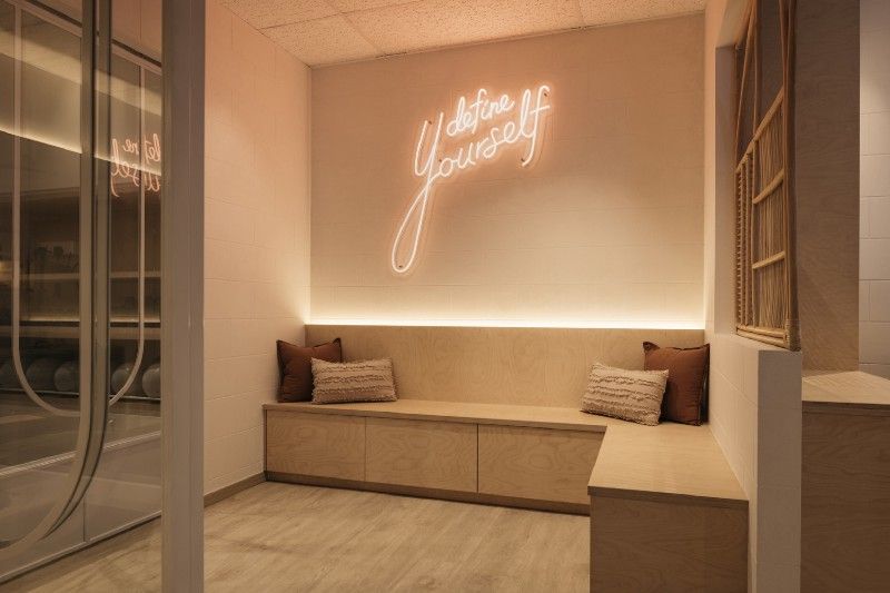
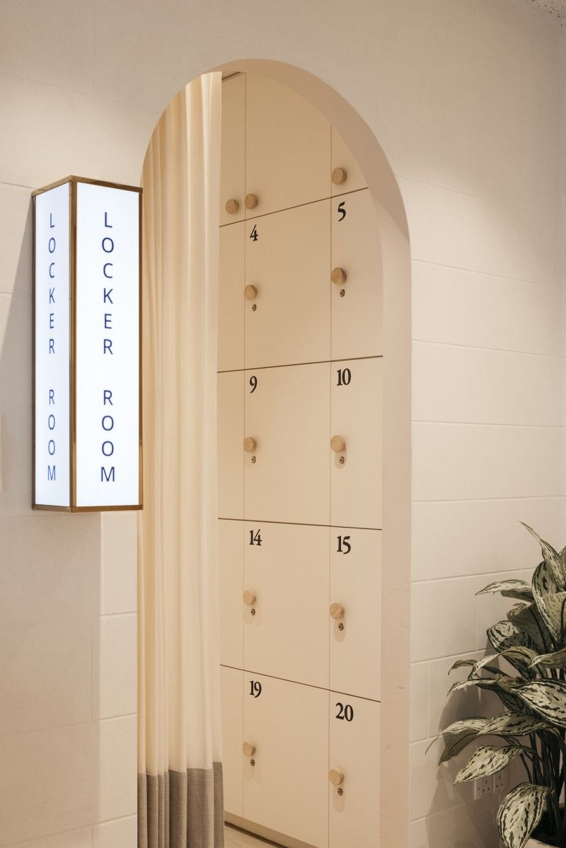
Thoughtful neon signs were used on the walls. The space arrangements and lights were used to facilitate sessions, accommodate the exercise equipment, and provide pre- and post-workout space.
The first studio was completed in 2019 and the second studio was completed in early 2021. Even though both studios share a similar concept, each studio has unique design features connecting to the brand and distinguishing them from one another at the same time. The design, colours, and arrangements are soothing, so they surround the members with positivity and good vibes.
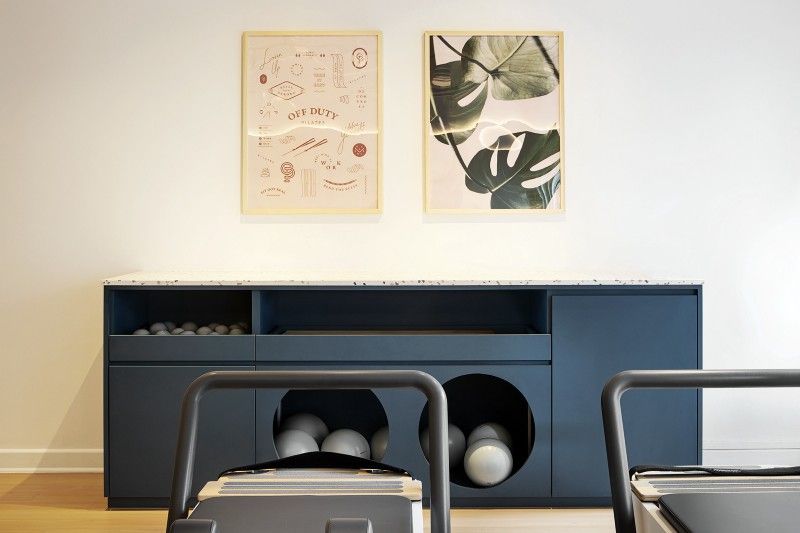
For the first studio, I incorporated different colours in the design as colours have a significant impact on our lives. Colour blocking was introduced, pairing a few solid hues to create a single bold look. Unexpected combination of colours in different parts of the room such as orange walls with deep blue coloured cabinets. Orange colour is known for its warmth, enthusiasm, and energy whereas blue colour increases stability and focus and has calming effects.
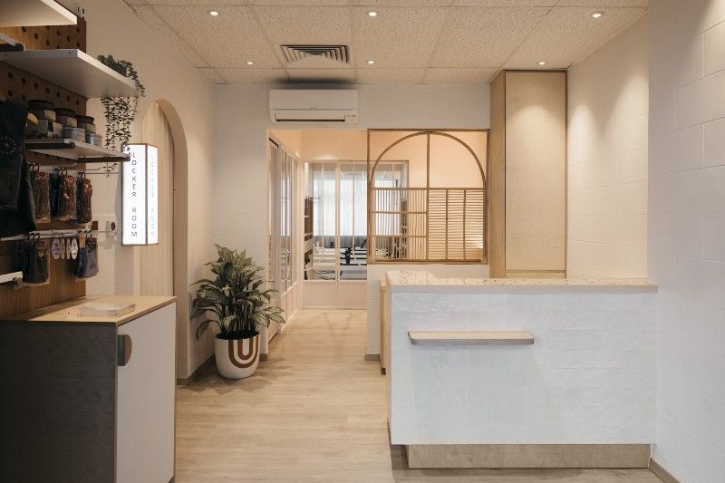
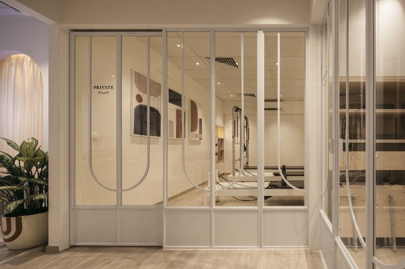
For the second studio, the clients wanted something different while representing the same brand. So, this time, instead of using colour blocking, a more refined palette of light materials was used, incorporating birch plywood and using a white on white concept, showcasing material textures such as glazed artisan tiles on the reception counter against a textured wall that looked like white cinder blocks. Soft curves were used to capture the element of flow and movement. Subtle curve detailing was eminent throughout the studio, from the entrance tot customize screens.
This was all about this project. What’s your take on it? Don’t forget to tell us about your views in the comment box. Share with your friends as sharing is caring. To find out more about my projects or tips and tricks, be sure to follow the blog. Stay healthy and stay tuned.
Connect with me on Instagram, Facebook, Pinterest and LinkedIn.
Photography by Infinitude (Craig Rd) and Studio Periphery (Orchard).
Thank you,
— Shan
