Renovation of a HDB unit in Telok Blangah Crescent, Singapore
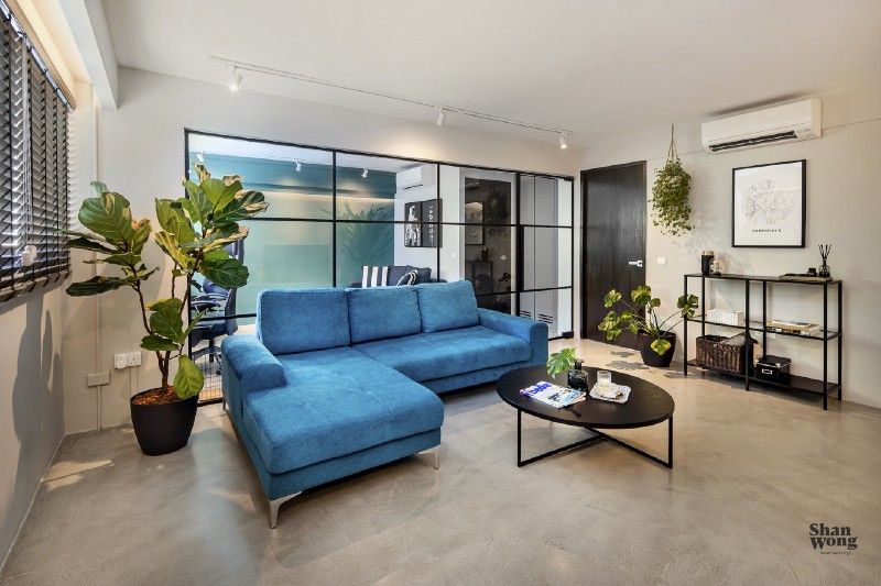
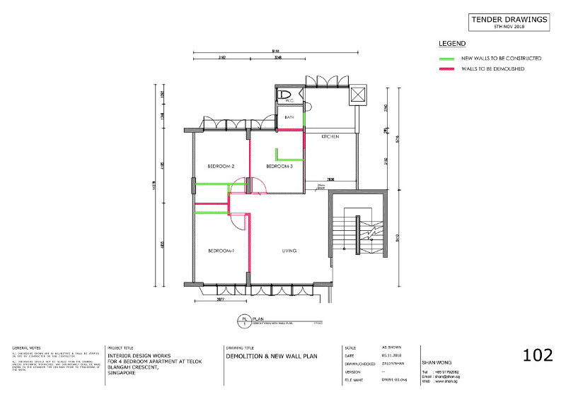
In 2019, Shan Wong remodelled a 90 square meters HDB unit in Telok Blangah Crescent. It was constructed in the 1970s and was on resale. The 4-room (3 bedrooms + 1 living room) unit was redesigned into a three-room flat (1 bedroom and an office space). One of the main features of this plan was to increase space and a bright home.
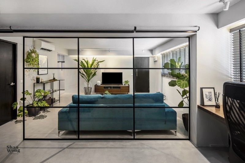
The new design transformed a boxed-in house plan into a more spacious and airy plan. Some walls were knocked out and replaced with a high-quality glass partition wall to add a sophisticated and dynamically stylish touch to illuminate and connect different spaces of the home.
This unit is located at the foot of Mount Faber and is surrounded by greenery. Shan wanted to bring the natural elements of the surrounding to the inside as well by incorporating as much space for plants as possible making it refreshing, purifying, and visually appealing. For floor finishing, Shan opted for Pandomo to get seamless and hard-wearing cementitious finishes for the entire floor.
Living room
The interior of the living room was designed to provide a relaxing space for the residents. The walls were painted in warm grey colour to make the home more inviting. A center staged L-shaped turquoise sofa and dark furniture contrasting the white backdrop were added to complete the look. As the incorporation of natural elements was one of the major themes of this project, indoor plants were added to give a sense of freshness and stress relief. The living room was spacious enough to add extra seating when needed.
Dual usage room
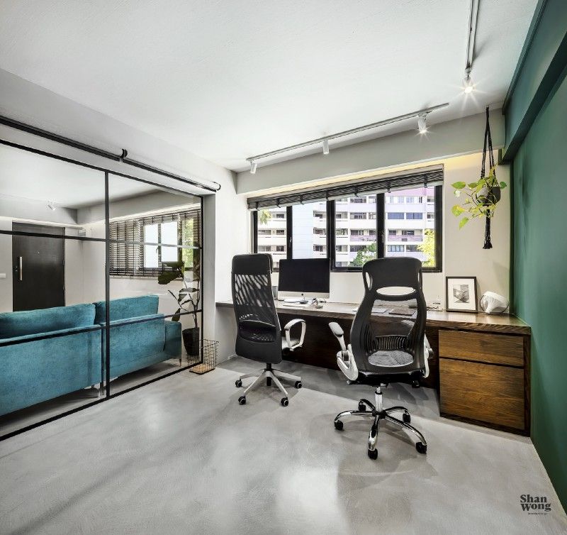
The space dedicated for office was specifically designed to keep up with the professional needs of the owners without compromising on their productivity. The bright and airy interior of the office room with sufficient storage space, an outdoor view, and vitalizing airflow accommodated one big working desk seating two persons. Instead of introducing a feature wall with carpentry works, Shan went with painting the large wall in a bold emerald green colour, turning the plain wall into a feature. The glass panes played a significant role in connecting the office space with the rest of the home and keeping the distractions away at the same time. This space of the unit was designed as a multi-purpose room serving as an office and a guest room when needed. Roller blinds were installed to add privacy and close off the room.
Kitchen
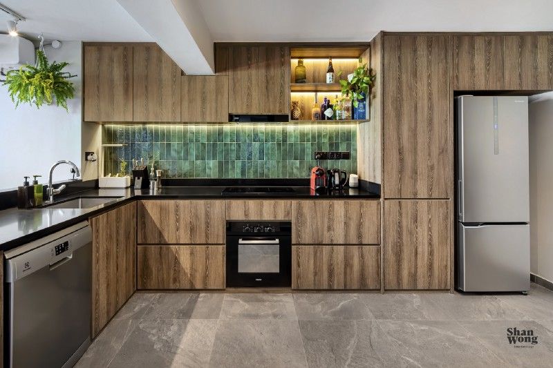
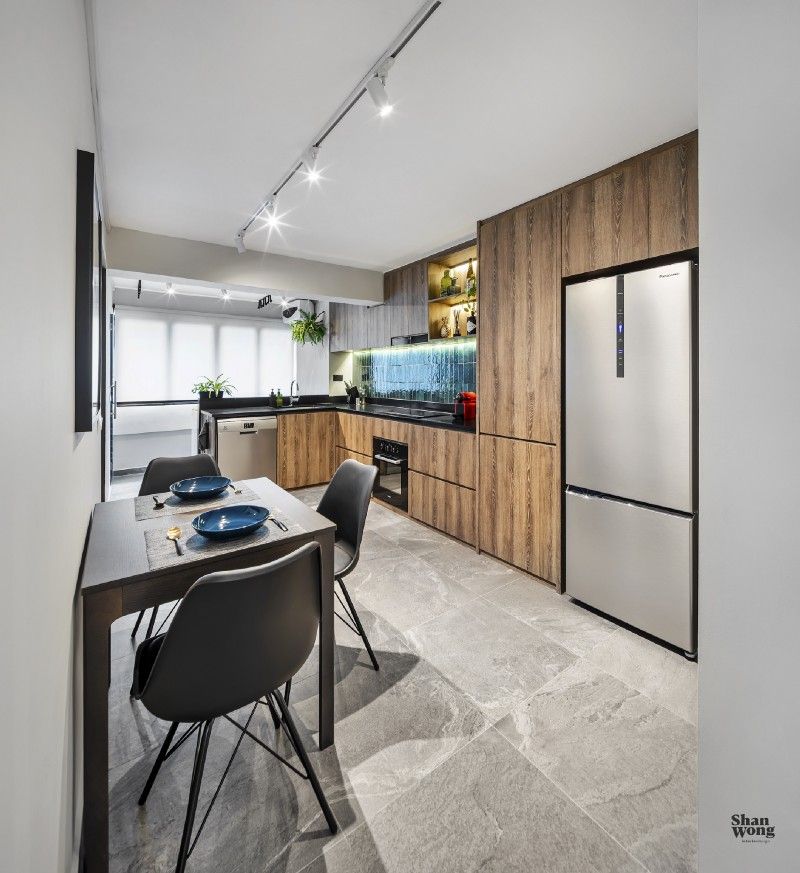
Kitchens are known as the heart of the homes. A sleek and clutter-free kitchen with plenty of storage space was designed with enhanced functionality, dining area, and installed electrical appliances including a dishwasher. To synchronize with the natural elements and to enhance beauty, easy-to-clean green tiles were used as backsplash, adding texture. Indoor plant pots were added near the window. The eminent part of the kitchen was a wall-mounted bar with perimeter LED lights installed on the underside of the shelves. The illuminated bar, green tile, beautiful countertops, and high-tech gadget and smart home integrations made the kitchen a pleasant and updated yet aesthetically appealing workspace.
En-suite Bathroom
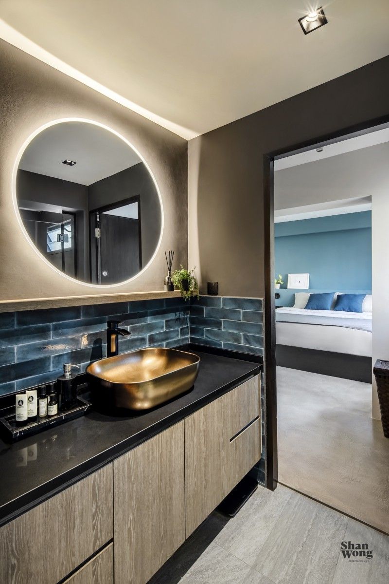
A bathroom is an important space in a home that serves for your care, relaxation, and hygiene. Keeping this in mind, the interior of the bathroom space was designed to enhance the functionality and make it classy. A rose golden sink with a black tap was installed. A big backlit round mirror was added to create a beautifully illuminated curves effect and give it a luxurious look. The colour scheme was chosen carefully and instead of keeping the monotone outlook, light and dark shades of brown were used. Blue tiles added more vibrant colour and a minimal yet decorative look. The accessibility of the bathroom was specifically taken care of. It was made accessible from both the kitchen area and the bedroom, making it an en-suite bathroom and shower.
Bedroom
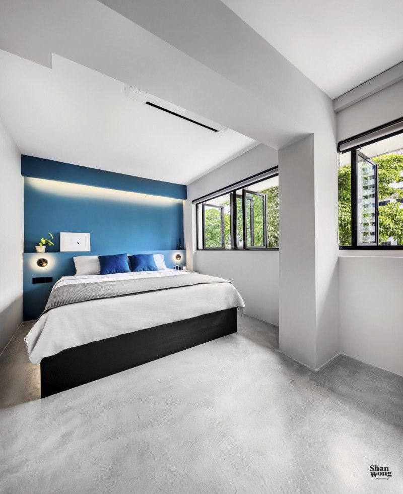
The bedroom is a significant space of a home where we relax and regain our energy to deal with everyday challenges. The bedroom of this unit was surrounded by greenery with big windows making it well-ventilated and bright. The walls and ceiling were painted white light to enhance the sense of space and light. An eye-catching marine blue accent wall was used as a bedhead feature.
To find out more about Shan’s projects or tips and tricks, be sure to follow the blog. Don’t forget to tell us about your views in the comment box. Stay connected to know more about our amazing projects.
Thank you.
Photography by Joseph Goh/Infinitude.
